Let me present you with a scenario. You’re planning your perfect autumn sweater. You’ve identified the pattern and yarn you’d like to use, but you’d like to make a small tweak. The pattern’s written for long sleeves, and you prefer three-quarter length. How do you know how much yarn you need?
Read moreYokey Dokey Sweater Kits
One of the perks of my job is that I get an early preview of some fabulous new designs, and I’ve been excitedly waiting for the release of Gudrun Johnston’s Yokey Dokey Sweater since it first landed in my inbox at the end of April. Working with Gudrun is an absolute joy, and I have really enjoyed seeing the test knitters working on a range of beautiful colourways over on Instagram. You can browse what they have been up to with the #yokeydokeysweater hashtag.
I’m happy to share that yarn kits for the Yokey Dokey sweater, are now available in the online shop!
Read moreErrata – the bane of my life (part 2)
On Wednesday, I wrote about the work that we do to avoid mistakes creeping in to our publications. Thank you for all the kind feedback I have had following on from that post. I’m always going to find it hard dealing with making a mistake, but it definitely helps to feel that people understand. In today’s post, I’m going to explain what we do when we find a mistake.
Read moreErrata – the bane of my life (part 1)
I wish that I could sit here and tell you that there will never be an error in any of the patterns we publish. We strive for our patterns and tutorials to be errata-free, every day. But the reality is that we are human, and knitting patterns are surprisingly complex.
Read moreJune Pattern Round-Up
Much of June was taken up with promotion work, but there have still been a few patterns that have crossed our desks and been published.
Summer is most definitely shawl season, and Bristol Ivy's eye-catching Rillmark stands out from the crowd.
It takes its name from the marks left in the sand by the retreating water once a wave has broken on a beach. It has a clever construction in the way that increases are worked not only in the body of the shawl, but also in the edging without any obvious break in the pattern.
Conifer, a baby cardigan, is the latest release from Ella Austin's Colour and Line Collection.
Any child wearing this beautiful cardigan will undoubtedly get jealous glances from all quarters.
Keep up to date with all we're doing:
Arnall-Culliford Knitwear on Facebook | Arnall-Culliford Knitwear on YouTube | Arnall-Culliford Knitwear on Ravelry | JenACKnitwear and VeufTricot on Twitter | JenACKnitwear and VeufTricot on Instagram | And sign up in the sidebar to get our blog posts delivered to you by email.
Photos © Bristol Ivy and Emma Solley (Ella Austin) respectively
Musings on construction
I've been thinking a great deal about the different ways to achieve outcomes in knitting over the last few months (actually, I've probably been thinking about it since I started knitting 10 years ago). There are many ways to get to a similar end point - say a cardigan. Some will favour knitting in pieces and seaming, others will do anything to avoid a seam and will knit the body flat and the sleeves in the round. You can then choose whether to start at the bottom and knit up, or whether to start at the neck and work down. Depending on the sleeve construction, you may pick up the sleeves and work down to cuffs, regardless of which direction the body was worked in. And you can even choose to add a few stitches as a bridge at the centre front (a steek), and work everything in the round, cutting the steek later. Or work from side to side, starting at one cuff and working across to the other.
So with all these choices available, how do you decide which route to take? Much will come down to personal preference:
To seam or not to seam?
Would you rather work flat or in the round?
Other choices will be determined by the design itself:
Does the stitch pattern dictate one technique or another?
Does your sleeve construction (raglan, set-in sleeves, yoke etc...) particularly lend itself to a construction?
And then there is the psychology of working on a project. I love the sense of acceleration you get as you work through the yoke of a seamless yoked sweater. The rounds get progressively shorter, and with the end in sight it seems to fly by. Having two sleeves left to work at the end of a sweater is my personal knitting black hole. Will these sleeves NEVER END?! Far better for me to get them out of the way early on, when my project enthusiasm is high. My Stopover sweater was a great example of this: By the time the sleeves and body were joined for the yoke, I could almost feel the warmth the finished sweater would give me. As well as the decreasing rounds, there was the excitement of the colourwork pattern at the top of the yoke, and once I reached that point, I just couldn't stop knitting.
The best thing about all this, is that despite what some may tell you, there are no wrong or right answers. It's your knitting, and you can work in whatever way suits you best!
I'm currently editing the A-MAZING designs for a book of Haps, that I'm working on with Kate Davies. The thirteen designs use a range of constructions, and I can't wait to tell you more about them over the coming months. My needles are itching already, and I might have made a cheeky yarn purchase too...
Masterclasses
Just in case you've had an unrequited longing to learn the Channel Island cast-on method, I thought you might like to know that I've got a Masterclass article in the latest issue of The Knitter (Issue 73). It's all about different cast-on methods and there will be an article on casting off next month as well.
And while we are on the topic of casting on... I've been asked a few times why it's sometimes "cast on" and other times "cast-on", so I figured I might as well commit the answer to the blog, and save on typing it out again. :) As you might expect, it all comes down to grammar.
If you are instructing someone to cast on a certain number of stitches, cast on is being used as a verb, and as such does not require a hyphen. E.g. Cast on 65 sts.
If you are describing a part of the knitted fabric, such as a cast-on edge, then cast-on is now an adjective, and it's common to hyphenate compound adjectives such as this. E.g. Return to the cast-on stitches and unzip the crochet chain.
Confusion starts when talking about types of cast-on method. E.g. The Channel Island cast-on. In these instances I tend to consider cast-on as an adjective to method, rather than as a noun in its own right. So even if the word method is omitted I hyphenate it.
I'm no grammar specialist, and I'm indebted to Helen Spedding on The Knitter for explaining this to me when I first started on the magazine (after I had just added hyphens to the start of every pattern just before deadline - oops!), but I do love a geek fact, and this seems to fall into that category quite nicely!
Drawing knitwear schematics in Illustrator: Part 3
Today's post covers refining your outline shape - adding curves and details - as well as adding measurements and aligning. This completes the series on using Illustrator to draw knitwear schematics. The first two posts in this series covered setting up preferences and layers in Illustrator, and drawing basic outline shapes.
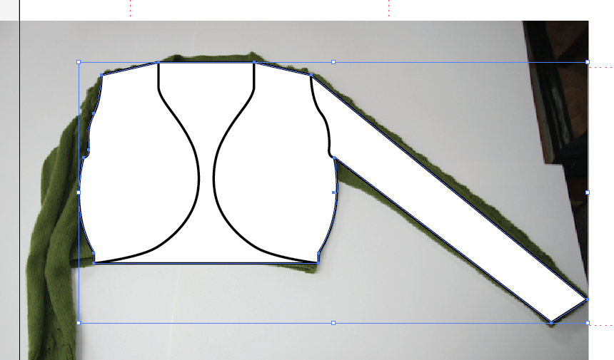
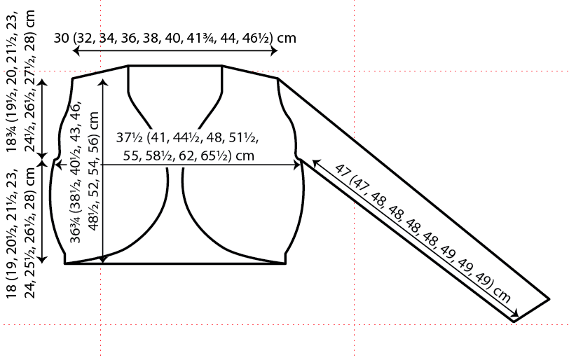
This is the basic angular outline shape for our schematic. It is the schematic for the Droplet Bolero from A Stitch in Time 2 (which should be landing on my doormat some time today or tomorrow - squeal!).
In order to add curves to the shape, we will convert some of the anchor points. So for example, at the bottom right of the diagram, we want to introduce a curve after the welt. Select the outline using the black Selection Tool, and then choose the Convert Anchor Point tool. This will be found underneath the Add Anchor Point tool that you used earlier (click and hold on the fountain pen icon to see the other options).
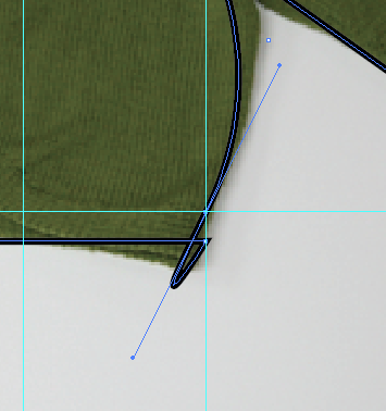
You then click on the point where you want to introduce a curve, and drag a handle out a little way from the point. Don't be alarmed when your lines look like they have "gone wrong", this is normal.
Curves are added using a Bézier tool. This is particularly brilliant, because it means that your image can be scaled as large as you wish, without pixellating. The curve is controlled at each side of the anchor point, using the two handles (shown with small blue circles in the image above).
Get a feel for how the handles control the curve by using the white Direct Selection Tool to move the handles round. Try moving them further away from the anchor point, following the same direction, and see how this changes the curve.
We only want a curve on the upper side of the anchor point, so we will first of all remove the handle on the lower side. You do this by simply picking up that lower handle, using the white Direct Selection arrow, and drag the handle back onto the anchor point. You should "feel" it snap away. Drop it there, and you will now only have a handle (and thus a curve) on the upper side of the point.
Adjust the remaining handle until you are happy with the shape of the outline. Repeat this process at all the points where you require curves. You can use guides as before to ensure that the curves are the same on both sides of the outline. Just snap the handles to guide points.
Now that the outline is complete, lock the outline layer, and unlock the detail on outline layer.
Add lines to your drawing to show details such as front openings, armhole shape, pockets etc... Use the Line Segment Tool, and set the stroke properties in the same way that you did for the outline shape.
Convert anchor points to add curves to the detail lines as you wish.
If you want to add two elements that look identical, but are mirror images of each other, then you can use the reflect tool.
Select the item you wish to reflect, using the black Selection Tool. Then go into the Object menu and choose Transform... From the submenu, you can then pick Reflect...
Choose whether you want to reflect it horizontally or vertically, and then rather than hitting OK, choose copy. This creates another object, rather than transforming the selected object.
Then simply move the new front edge line into place, using the arrow keys.
Add any other details, that you require, to the outline drawing. Then lock the detail on outline layer and unlock the outline layer.
Select the outline shape and making sure that the fill toggle is to the front, add a white fill to the basic shape.
If you are happy with the shape, then lock the outline layer and unlock the scan layer. You can now delete the photograph out of your file. Then relock the scan layer, and unlock the measurements layer, as it's time to add some arrows to the diagram.
Arrows are added very simply as lines using the line segment tool. If you hold down shift while drawing the line, it will automatically be either horizontal, vertical or on a 45 degree angle.
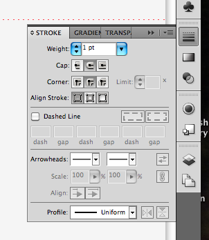
Once you have added the line, you can use the Stroke palette to choose its properties - thickness, shape of arrowheads and so on.
At this point it may be helpful to make the guides visible again (select Show Guides from the View menu, and Guides submenu). Be sure to use the white direct selection arrow to change the length or position of the ends of your arrows, or you will stretch them, thus making the lines different thicknesses.
Unlock the text layer, and use the Type Tool to start a text box. Simply type your measurements into the box, then choose the font and size from the Character palette.
To make your text align nicely with the arrows, you will need to choose which object is the Key Object. Once you have selected a Key Object, it doesn't move, and the other object must move to align with the Key.
Select two objects using the black selection arrow.
Then hover over the item you want to align to (in this case it's the arrow which has been carefully placed to line up with the shoulders) until you see the black arrowhead, and click on the arrow again. If you have done this correctly, the arrow (or your Key Object) will have a thick highlight over it.
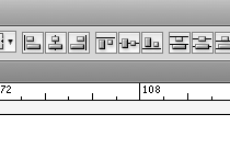
Now choose how you want the text and arrow aligned, and only the text will move. I want these horizontally centre aligned, so I click on the icon which shows the objects in that formation (second from left in the picture below).
Repeat the process, adding measurements and arrows as necessary to your diagram.
Once you are happy with your finished diagram, be sure to lock all of the layers, and make sure that they are all set to be visible.
You can then choose to output your diagram in a wide range of formats. If you are working on an InDesign file for your pattern, the Illustrator file can be placed straight into it. Alternatively, you can choose from png/pdf/tif/jpeg/windows meta file and many other formats for your finished schematic.
Please don't hesitate to leave a comment if you have any questions. I hope that this series has been useful.
Jen x
Drawing knitwear schematics in Illustrator: Part 2
Last week's post covered setting up your preferences and layers in Illustrator. In this post, I will cover drawing basic outline shapes, then I will do a post on finishing off the schematic, covering things like adding curves and alignment.
I like to draw schematics from an overhead flat shot of the garment. It means that the drawing will give a good impression of the shape of the piece, without having to spend ages drawing lines to scale from measurements. To get a good outline photo, make sure that you take the picture from directly overhead. The garment in the example below is the Droplet Bolero from A Stitch in Time vol 2.
If you can't find one of the palettes I refer to, look for it in the Window menu, and once it is open, you can drag and drop it onto the right hand side of the screen.
The image will be built from the bottom upwards, starting with the main outline of the piece (details like front openings or front neckline can be added later).
Unlock your bottom layer (in my case it is called Scan) by clicking on the padlock icon on the Layers palette. Click on the layer so that it is highlighted in blue, and therefore active. Then choose Place... from the File menu and select the image file for the photograph you wish to use.
Use the black arrow (the Selection Tool) to resize the photograph. Holding down shift while you do so will ensure that the proportions of the picture are retained. If you also hold down the alt key, then the photo will stay centred in the same place. Resize the photograph so that it sits comfortably on the artboard, with space around it for arrows and measurements.
Once you are happy with the size, then lock the Scan layer. Now you won't be able to move the photograph by mistake. If you need to adjust it later, you will simply need to unlock the layer again before making any changes.
Now unlock the layer where you plan to draw the outline shape of the garment. Click on the layer so that it is highlighted in blue. Make at this point that you have selected Snap to Grid in the View menu.
Then choose the Rectangle tool from the palette of options on the left of the screen. If you can't see a plain rectangle, the it might be hiding underneath one of the other shape tools (ellipse, polygon, star, rounded rectangle etc...). Just click and hold on the tool button to see the other options and select the rectangle tool.
Draw a rectangle over the body of your garment.
Then select the fill by making sure that the filled box is to the front on the toggle on the left-hand side of the screen.
And choose a fill colour from the Swatch palette (or use the Colour palette if you want more control of the exact shade). I usually fill the outline shape with white. This means that if your schematic is placed onto a coloured section of page, the outline shape will have a white background. If you have no fill (the red slash through a white box), then the schematic will have the same background colour as whatever it is placed over.
Then click on the stroke toggle, so that the outlined square comes to the front.
You can now choose the outline for your schematic. You select the colour you want from either the Swatch or Colour palettes as before. Then you also need to select how thick your outline line will be, and whether it will have sharp or rounded corners. You make these choices on the Stroke palette (the button with different types of horizontal line) on the right-hand side of the screen.
I use a 1 pt line thickness with rounded corners and ends. Play around with the options to see what effects you like best.
To make the outline into your desired shape, you will need to add some more anchor points (unless you want to draw a schematic of a rectangle of course). Anchor points are the handles at the corners of your shape, and by adding more, you can make a more complex shape. Make sure that your rectangle is selected and you can see the selection outline and small square handles at the corners (in the picture above, showing the rectangle, these are shown in blue). Choose the Add Anchor Point tool from the tools on the left of the screen. It may be hidden under the Anchor Point tool, in which case click and hold to choose from the other options available. The tool looks like a fountain pen with a small plus sign beside it.
Use this tool to click on the outline shape to add points whereever you will want to put a corner in your shape. Add more than you think you will need as you can always subtract them later.
Then use the white arrow (Direct Selection tool) to select and move the new anchor points. In doing so you can start to create the shape that you require.
Continue to add anchor points and then move them until you are ready to fine-tune the shape. You may find it easier at this point to temporarily remove the fill from your shape, so that you can see the photograph below more clearly.
Having created the rough overall shape of the piece, we can now tweak it to ensure that elements are lined up correctly with each other. I will cover adding curves to the shape in the next post.
To check that your neckline is in the centre of the piece (assuming that it should be!), add some guides to the workspace. Guides are lines that won't appear in the final schematic and are just used to line things up.
Ensure that your rulers are visible at the top and left of your workspace. You can make them visible from the View menu. By clicking and dragging from the ruler, you can add guide lines to line up with elements such as the side seams, shoulder line, back neck or underarm. The guides below are shown in turquoise, with the selected guide appearing blue.
When you select two guides, you can then see how far apart they are by clicking on Transform at the top of the workspace. In the example below, the two guides are 21 pt apart.
To make sure that the back neck is correctly centred, I will need to add another guide to the picture, that is 21 pt to the left of the right side seam (as we are looking at the diagram) guide. Select the guide at the right side seam. Press Shift+Cmd+M (or Shift+Control+M if you are using a PC) to bring up the move dialogue box, and select a horizontal move of -21 pt. For horizontal movement: negative numbers move objects the the left, positive numbers move to the right. And for vertical movement negative numbers move objects up and positive numbers move objects down (that confused me for a while!). Rather than clicking OK (which would move the selected guide), you can click on Copy, which will add another guide at the selected distance.
With a new guide added, you can then move the anchor point for the back neck so that it lines up with the guide. This ensures that your back neck is centred.
You can also add guides so that you can add anchor points at the same height on each side of the piece. Since Snap to Grid has been selected, all of the guides and anchor points should automatically be snapping to points 1 pt apart. In this way they will line up neatly.
The horizontal guide above has been added to show the end of the edging at the bottom of the bolero. Anchor points are added to the outline, in line with the guide, at both sides of the shape.
Once you are happy with the shape and placement of the corners of the piece, you can get rid of all of the guides by selecting Guides from the View menu, and then choosing the Hide Guides option. You may need them later when adding arrows, so it's best not to clear them at this stage.
You should now have a basic outline shape, ready to add curves and details.
Drawing knitwear schematics in Illustrator: Part 1
One of the many jobs that I've done while working on A Stitch in Time 2 is drawing schematics for each of the garments. I thought it might be helpful to do a quick run-down on drawing these, as it seems to be a question that pops up from time to time on designer blogs and in the designer's group on Ravelry. I am using Adobe ® Creative Suite 5 ® (CS5) and my copy of Illustrator ® is version 15.0.0. I work on a MacBook Pro using OS X version 10.6.8. Some aspects may look a little different if you are using a PC or an older version of Illustrator, however the differences shouldn't be too significant.
This tutorial will be split into 3 posts. This post deals with getting your work space set up. The next post will be published next week, and will cover drawing your outline shapes in Illustrator. And the final post will cover adding curves, alignment and adding measurements.
The first job is to get your Preferences set up correctly. In the Illustrator menu at the top left of your screen you will see Preferences, hover over it and then choose General from the menu. Clicking on General gives you the following dialogue box of general preferences:
For drawing charts and schematics for knitting patterns, you won't need to use most of the possible settings on Illustrator. The first choice is your keyboard increment. This determines how far things move when you use the up, down, left and right arrows on your keyboard. For drawing schematics, I usually have this set to 1 pt. Choose your increment, but don't hit the OK button just yet.
Use the drop-down menu at the top of the dialogue box to select the Units screen. Then make sure that all units are set to Points (of course if you would rather work in inches or millimetres or pixels, then do - just make sure that you have your keyboard increment set to a sensible value for your units). Again, don't click OK just yet, simply select the Guides and Grid screen.
I generally work with a dot style of grid, and gridlines every 100 pt with 100 subdivisions between them. This means if I am snapping things to my grid, I have good control over where shapes are going. For drawing charts, then 10 subdivisions is probably plenty (each subdivision will be 10 pt apart rather than 1 pt that I use for schematics). Go wild with your colour choices, but it's probably worth choosing a colour that you won't be using in your schematic or charts.
Having set up your Preferences, you can open a document. When you choose New... you will be asked for a document name and the size of your Artboard (the area on which you will be drawing). I've named this Sample and chosen A4 size.
If you aren't seeing the red gridlines you may need to choose Show Grid from the View menu.
The next step is to set up some layers to work on. I imagine these like sheets of tracing paper. They determine what shows up in your final image and you can move layers up and down like sheets of tracing paper in a stack. Things at the bottom of the stack may be covered up by the layers above. But they are more useful than that, because you can lock one or more layers while you work on others. So once your outline is finished you can lock it so that you don't mistakenly move things round while you are drawing arrows or something else. In fact, you can even make layers invisible for a while too, if that's useful.
I have my layers palette set up at the bottom of the options on the right of my screen. It's the button that looks like layers! If you can't see it, then you can choose Layers from the Window menu at the top. This will give you a Layers dialogue box that you can drag and drop over to the right of the screen.
You will automatically have one layer already. To add more, simply click on the little button at the top right of the Layers palette. It looks like 4 horizontal lines with a small downward pointing triangle to the left of the lines (on any of the palettes, this will give you more options). This gives you the layers options menu.
From this menu, you can choose to rename the current layer by going into the Options for "Layer 1"... dialogue box. You can also add new layers.
This is the dialogue box you get when you choose Add new layer...
Choose a name for your layer and click on OK.
I would suggest that for drawing schematics, it is useful to set up layers as follows:
There are 8 different layers and I've named them to give an idea of what I would use that layer for. You can move layers around by dragging and dropping them in your desired order. The eye symbols on the left show that all of these layers will be visible. If you click on the eye that layer will no longer be visible (and won't print out either). Next to the eyes are the padlocks. These determine whether a layer is locked or not. When it's locked you can't do anything in that layer. You can't even paste an item into the layer. The coloured strips next to the padlocks show you what colour the things in that layer will show up as when they are selected (this is just the boxes and handles round items that you use to move, resize and manipulate them, not the actual things you are drawing).
In the picture above you will see that the Scan layer is highlighted in blue. If that layer was unlocked, it would be the active layer, or the layer I was drawing in. If you have multiple layers open, then the blue highlight shows which you will be editing or drawing in. You can change the active layer by simply clicking on the layer you wish to be active.
You are now ready to start drawing things, so do come back next week for basic steps in drawing outline schematics in Illustrator.


